INNER GLOW
Brand Strategy & Visual Identity · 2025
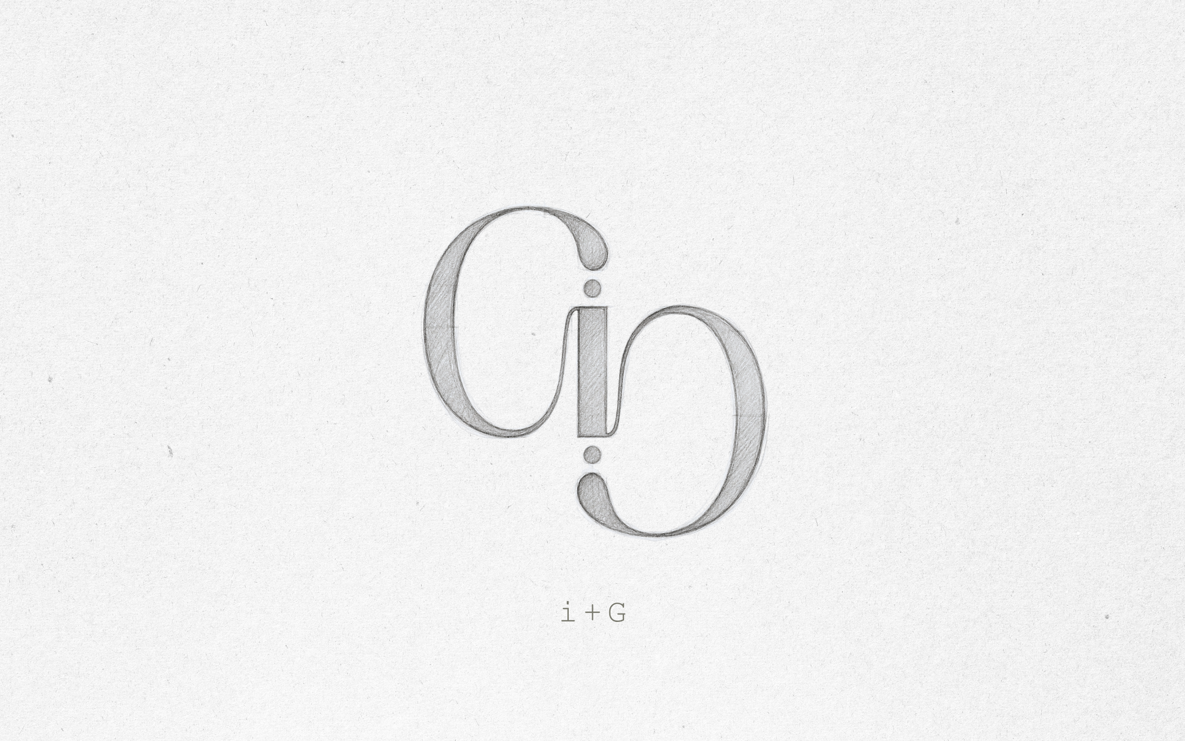
Everything begins with questions, with searching for answers, and with creating connections and contrasts.
Out of a deep understanding of the essence, the direction, and what is right for this brand in the long term, a strategy is built - and only then does the visual translation begin.
The initial sketches - and later the patterns - emerged from exploring rhythm, depth, and presence, driven by a desire to go deeper and refine. In this case, the patterns became an editorial extension of a highly future-focused brand, one that remains connected to its roots, to the ground, and to slow, precise processes.
Longevity, at its core, is choosing what lasts over what impresses for a moment - a mindset that favors balance, depth and continuity over sharp contrasts and instant effect.
The color system grew from that mindset: Ash Charcoal as a quiet anchor; Moss Field for adaptation and slow process; Deep Moss adding depth and continuity; Mineral Ivory bringing space, light and breath; and Loam Brown grounding the system with precise warmth.
The INNER GLOW monogram invites observation, connection, and personal interpretation. It carries subtle references to Yin & Yang, the infinity symbol, the two hemispheres of the brain, or the lungs - and each way of looking at it adds another layer, without canceling or challenging the others.
This multiplicity of interpretations reflects the many ways we approach things in life, with a shared thread of balance - between body and mind, between movement and rest, and between depth and softness.
- Longevity as a lifestyle
- Logo Sketches
- Brand pattern - an editorial extension